


There’s a famous saying,
“You never get a second chance to make a first impression.”
And indeed it is true for all aspects of life especially online where attention spans are short.
In eCommerce, a website gets the first impression of any business. eCommerce website design is often considered a strong parameter measuring business success.
A study by WebFX suggests that 75% of users judge a business’s credibility by its website design. You can guess the importance of a well-structured and professional-looking website.
So, in this blog, we’ll explore the key elements of effective eCommerce website design. Whether you’re starting from scratch or looking to improve your existing site, this guide will help you make a lasting impression.
Let’s get started!
What is eCommerce website design?
eCommerce website design is the process of building a user friendly online store where businesses can sell products or services directly to customers.
This involves more than just making a website look good. It includes designing the layout, choosing colors and fonts, and making sure the site is easy to use. It’s about creating a better online shopping experience that keeps people coming back for more.
Also, you need to make sure the website works well on all devices, from desktops to smartphones. From new eCommerce websites to established brands, everyone is now practicing this formula of success.
Importance of eCommerce Website Design
The design of your eCommerce website plays a crucial role in your business’s success. It’s more than just listing products, it’s the strategy.
Let’s explore why eCommerce website design is so important:
- Building Trust with Customers: In seconds, visitors decide if a website feels legit and easy to navigate. A clean, professional design builds trust and makes them want to explore further.
- Faster Buying Process: A clear and user-friendly website helps people find what they’re looking for quickly. This leads to smoother checkouts and more sales.
- Scalability: A well-designed website can easily adapt as your business grows. You can add new products, categories, and features without compromising the user experience.
- Search Engine Optimization: Good and SEO-friendly website design practices improve your site’s visibility on search engines.
- Easy Navigation: Simple and intuitive navigation keeps customers on the website longer and helps them find what they’re looking for easily.
- Mobile Compatibility: An effective eCommerce website design ensures your site looks and functions well on all devices and includes a wide variety of users as the target audience.
- Brand Identity: A unique design reflects an eCommerce brand’s personality and sets the business apart from competitors.
Best Practices for eCommerce Website Design
Creating a strong website design is important, especially for an eCommerce website. Here are some key practices to keep in mind when designing an eCommerce website that looks great and makes it user-friendly for customers to find what they need and make purchases with confidence –
1. User-First Design
Your eCommerce website must create a good first impression as I mentioned earlier. When customers visit the website, they should immediately feel welcomed by a clean, attractive design.
The layout should be interesting and should guide them effortlessly to the product they want. Also, keep accessibility in mind. Anyone with disabilities may visit the website – so you should consider having contrasting colors, readable fonts, and alternate texts.
Also, the website should load quickly and work smoothly on all devices. Focus on easy navigation and a clear product category section to make it easy for visitors to the website.
By focusing on user experience, you create a website that’s not just attractive, but also a pleasure to use.
2. High-Quality Visuals
Ultimately it’s all about showcasing and selling your products. Customers need to be convinced and high quality images can do that job well. It will give customers a clear and detailed view of products.
Invest in professional photos that capture the details and beauty of the products from multiple angles. Blurry or pixelated images leave a bad impression.
For visual products like clothing or furniture, offer preview options. Let customers zoom in on images to see the texture and details up close. If possible, include videos or a 360-degree view option to provide a comprehensive look at the product.
This approach can significantly boost the sales of any website.
3. Reflect The Brand Identity
For developers, a key aspect of eCommerce website design is ensuring a cohesive brand identity.
A cohesive design creates a recognizable brand experience for customers. This strengthens brand recognition and builds trust. This means using consistent visual elements like colors, fonts, and logos throughout the website. Consistency in these elements helps build a strong brand presence online.
4. Design for Every Device
In today’s digital world, the majority of online shopping happens on mobile devices. If a website isn’t mobile-friendly – they are missing out on a lot!
A responsive eCommerce website design ensures a website automatically adjusts its layout and functionality to fit any screen size, creating a smooth browsing experience for all users.
Think about how users navigate and interact with websites on their phones. Make sure buttons are big enough to tap easily, text is readable, and forms are simple to fill out.
A mobile-responsive design not only improves accessibility but also helps in capturing a larger audience. Prioritizing mobile optimization can lead to higher engagement and conversion rates for any eCommerce business.
5. Hero Products & Homepage Design
eCommerce home page is the first thing visitors see – so it has to be impactful. Use hero product photos on the homepage to grab attention immediately. It should be visually stunning, relevant to the brand, and grab attention.
Hero products help showcase the best sellers, new arrivals, or special offers.
A well-designed homepage helps users discover what they need quickly. Ensure that the images are linked with the product pages to help audiences find what they need without any hassle.
6. Reviews & Customer Experiences
It’s important to build trust with potential customers.
Having a ratings and review section can make it possible.
Potential buyers often rely on the opinions of others to make informed decisions. When users see positive feedback and high ratings, they are more likely to make a purchase.
This can be done by incorporating features like text quotes, short video testimonials, or even happy customer photos using the products. Also, a drop-down menu list where customers can input their age, product size, and other evaluation criteria can be a game changer for the website.
7. Prioritize Search Functionality
A search bar helps users quickly find what they are looking for instead of searching for a needle in a haystack. It leads to a smoother shopping experience and increased sales.
It’s a developer’s duty to place the search bar in a prominent location on every page, like the top header. Users shouldn’t have to search for the search bar itself! Also, search autocomplete can further increase the usability. This feature saves time and helps users find what they’re looking for with minimal effort.
8. Streamlining the Checkout Process
Your job is to focus on making the eCommerce Website checkout experience as simple and straightforward as possible. Also, minimizing the number of steps required to complete a purchase can make the process a whole lot easier for the users.
You can also implement features like guest checkout to speed up the process for new customers who don’t want to create an account. Along with that offer multiple payment options to accommodate different preferences.
8 Best eCommerce Website Design Examples
Now it’s time to get practical. Below we will see eCommerce sites examples with the details of their implementing the best practices. Ready?
1. The Ordinary
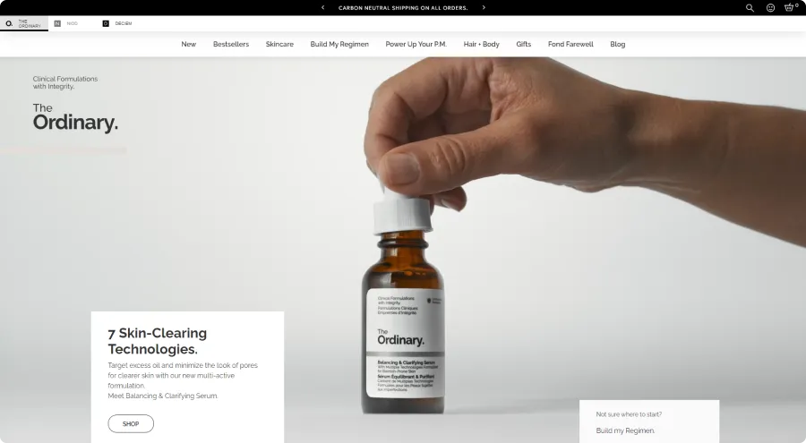
Website Name: The Ordinary
Industry: Skincare
Best Practices Used:
- Hero section showcasing product details in an aesthetically pleasing way. This grabs attention and provides a more engaging introduction to their products (Serum) than a static image.
- The homepage messages target a specific customer concern (“minimize the look of pores”) followed by a strong call to action (“SHOP”) to encourage immediate purchase.
- The “Build My Regimen” section on the homepage targets new visitors who might be unfamiliar with The Ordinary’s products. This helps guide them towards building a personalized skincare routine.
2. Change Toothpaste
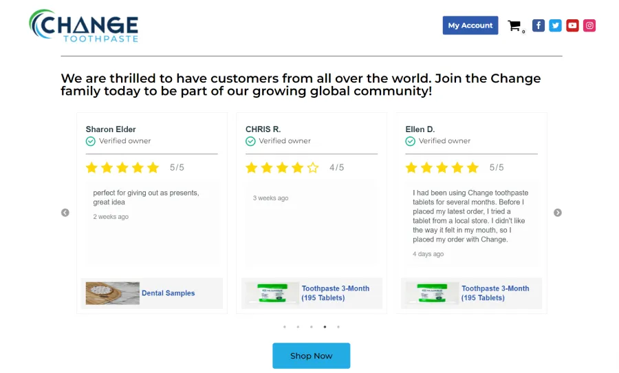
Website Name: Change Toothpaste
Industry: Oral Care
Best Practices Used:
- Change Toothpaste’s homepage features a section showcasing customer reviews and ratings to build social proof.
- They showcase verified customer reviews with names, ratings, and brief comments. This allows potential customers to see firsthand what other users think about the product’s effectiveness and overall experience.
- They positioned customer reviews near product information and the “Shop Now” button to influence visitors’ purchase decisions with positive user experiences.
3. Home & Beyond
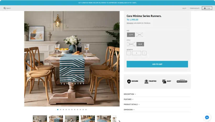
Website Name: Home & Beyond
Industry: Home Decor
Best Practices Used:
- Uses high-quality product images with sliders to see the product from different angles. It gives customers a better understanding of the design and craftsmanship.
- The website displays key product details like price, style, and size directly next to the image.
- This website offers dropdown menus for “Description”, “Features”, and “Dimensions” to access depth information without cluttering the main product view.
4. Sleepy Owl
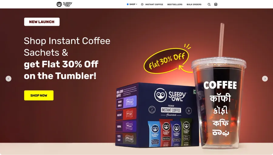
Website Name: Sleepy Owl
Industry: Beverages (Coffee)
Best Practices Used:
- The website uses multiple banners in the hero section to allow visitors to identify the products or offers they are interested in quickly.
- Each banner features a prominent “Shop Now” call to action button to help visitors take the next step in their buying journey.
- The header menu includes clear options like “Best Sellers,” “Instant Coffee,” and “Bulk Orders.” It also has a search bar and a shopping cart icon to make the navigation simple and user-friendly.
- To reduce the number of steps to find a product or offer, each banner image redirects visitors to specific pages.
5. Cowboy
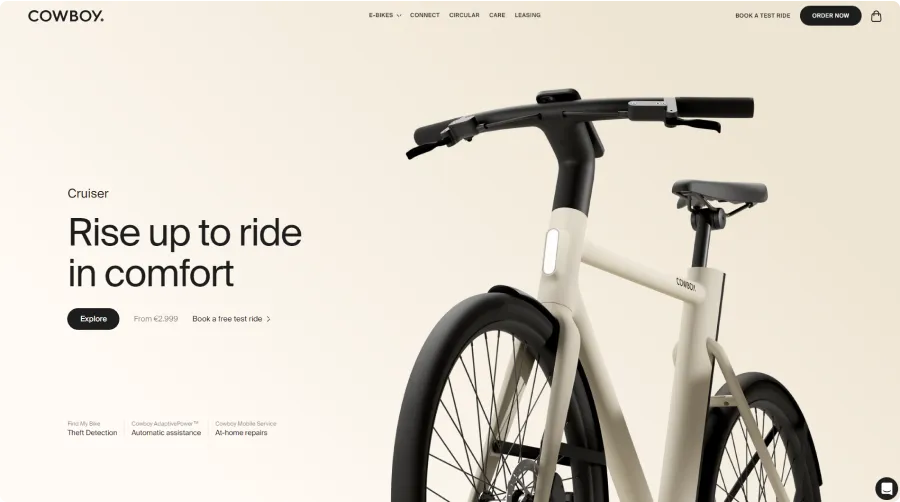
Website Name: Cowboy
Industry: Electric Bikes
Best Practices Used:
- Cowboy’s website effectively blends a minimalist aesthetic with high-quality visuals and interactive elements.
- The hero section clearly mentions the starting price (“From 2.99”), which helps set expectations.
- The header includes CTAs like “Book a Test Ride” and “Order Now.” These options make it easy for visitors to take the next step, whether they want to try the bike first or make a purchase immediately.
- The site features interactive demonstrations to explore the bikes in detail.
6. Huel
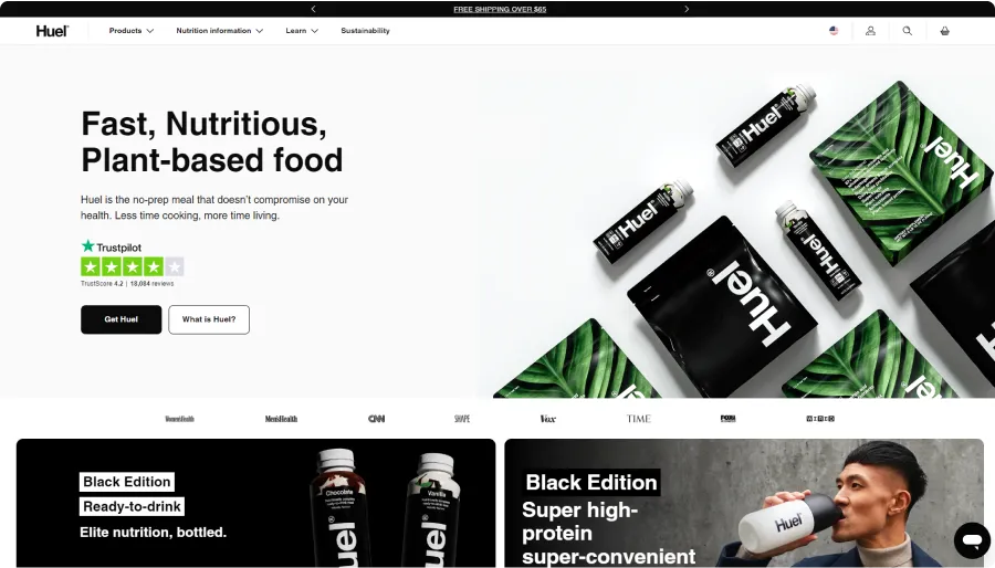
Website Name: Huel
Industry: Nutritional Products
Best Practices Used:
- Huel maintains a consistent brand identity throughout its website using a black, white, and green color scheme. This creates a sense of professionalism, trust, and brand recognition for visitors.
- It offers two clear CTAs in the hero section: “Get Huel” and “What is Huel?”. This helps visitors at different stages of the buyer’s journey.
- The hero section features an aesthetic photograph of various Huel packages.
- Below the hero section, the site highlights logos of companies and magazines that have featured Huel to build trust and position itself as a credible and reliable brand.
7. Notebook Therapy
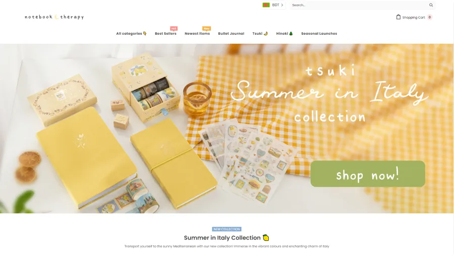
Website Name: Notebook Therapy
Industry: Stationery
Best Practices Used:
- Notebook Therapy’s website uses consistent visuals, from simple hand-drawn illustrations to sticker-like thumbnails. This playful style reflects their brand personality and the fun, creative nature of their stationery products.
- The navigation menu highlights all categories, including “Best Sellers,” “Newest Items,” “Bullet Journal,” and “Seasonal Launches,” making it easy for visitors to find what they need.
- Emojis are used throughout the site, including in the menu items, and headings. This adds a fun and friendly touch that aligns with the brand’s approach and appeals to its target audience.
8. 5S
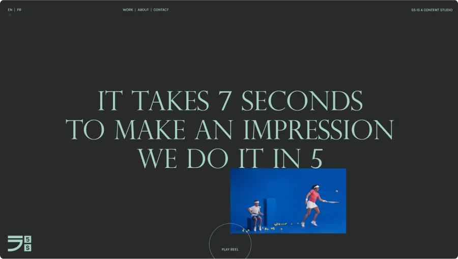
Website Name: 5S
Industry: Creative Content Studio
Best Practices Used:
- 5S’s website features a unique user-triggered color palette. Clicking anywhere on the background or refreshing the page changes the entire color scheme.
- The site uses subtle, layered animations. Video content starts hidden behind the text and then moves in front as users scroll.
- Hovering over promotional videos automatically plays them on mute.
- They highlight their client logos and work on the homepage to increase credibility.
Final Word
That’s a wrap! We have explored the best practices in eCommerce website design along with examples of some of the cool websites.
Remember, the goal is to build a site that not only looks great but also makes it easy for customers to find what they need and make purchases confidently.
I hope by following these best practices and getting inspired by the examples you will be able to design an eCommerce website that helps businesses thrive!
See you in the next blog!
FAQs
What are some common mistakes people make with eCommerce website design?
Using low-quality visuals, having a confusing checkout process, no design hierarchy, not enough white space, and not being mobile responsive are some of the common mistakes people make with eCommerce website design.
What are some key elements to include on the homepage of an eCommerce website?
Include high-quality hero images or videos, clear calls to action, a wishlist, a shopping cart, product highlights, customer testimonials, and easy access to different product categories.
How much does it cost to design an eCommerce website?
The cost of designing an e-commerce website can vary greatly depending on several factors, such as the complexity of the design, the features and functionalities you need, the experience level of the designer or agency you hire, and the size of your product catalog.
A rough estimation can range between $500 to $10,000+ depending on the business needs and the agency or package you choose. It’s always best to get quotes from different designers or agencies to find the best fit for your budget and needs.
Meet Mehrin! A technical writer with a Computer Science background. She combines her academic knowledge & creativity to transform complex facts into engaging content. With a sharp eye for detail, she keeps readers updated on tech trends. Outside of writing, she’s a visual storyteller, capturing life’s moments through photography.